Ben McQuhae & Co
Broadening the traditional law firm identity
Scope:
Ben McQuhae & Co is a newly established commercial law firm in Hong Kong committed to sustainability and innovation. They apply their legal expertise to support clients who are contributing to the global imperative of building a sustainable future.
We were tasked to establish a brand identity that differs from the ‘traditional’ law firm imagery in Hong Kong and implement such identity consistently across their branding assets. We worked closely with our client to bring their vision to life.
Visit the website here.
Un/educated’s client project (with Jonas Fries and Luis Rodrigues)
Timeline:
8 weeks
My Role:
Branding, Web design (UX Design, UI Design), Project Management
Tools:
Miro, Figma, Illustrator, Photoshop, WordPress (Elementor)
Co-creating brand identity with our client
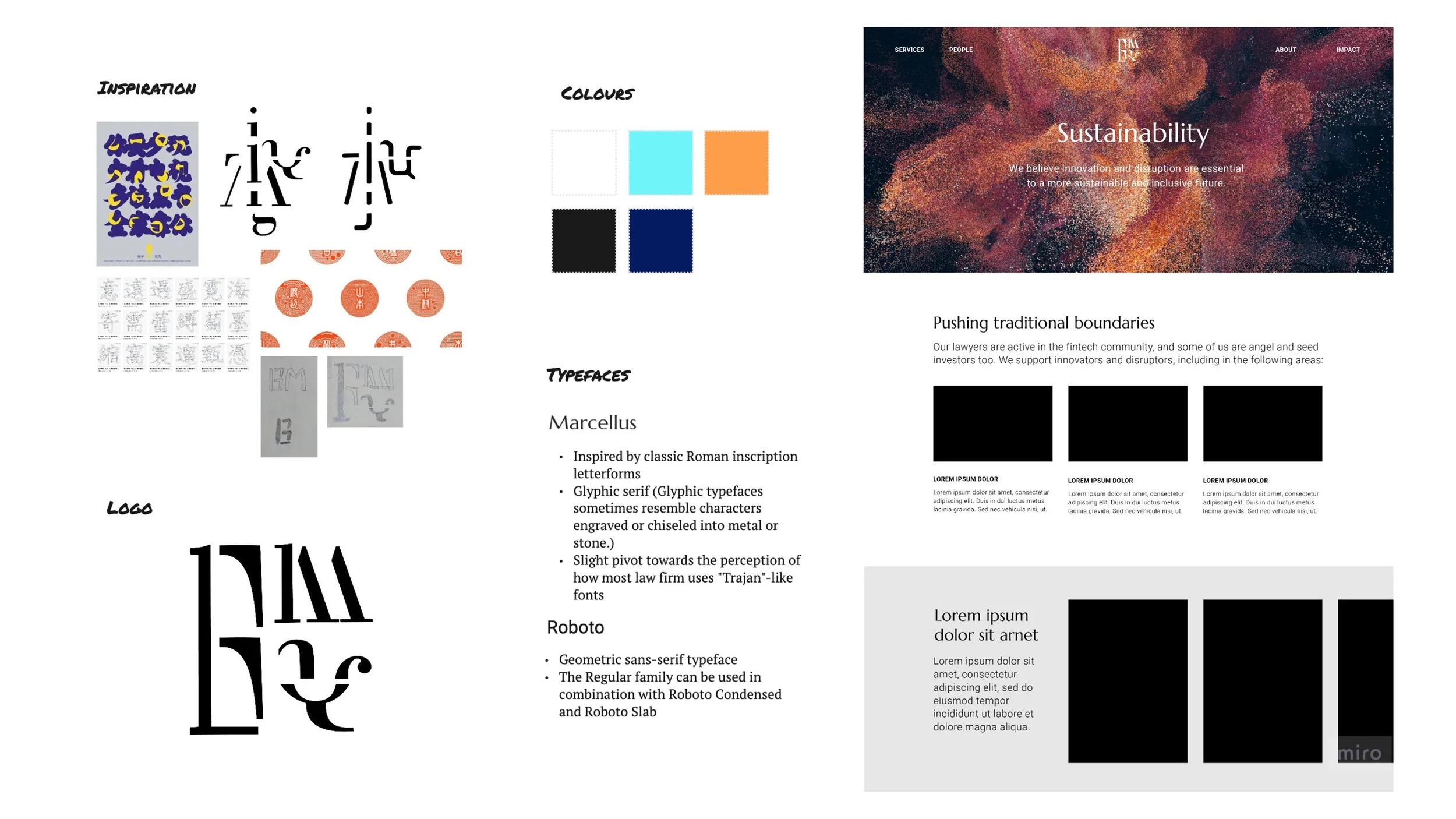
Exploring the Brand personality And visual identity
A workshop was conducted to understand the brand personality, and together we identified the key attributes to represent the brand.
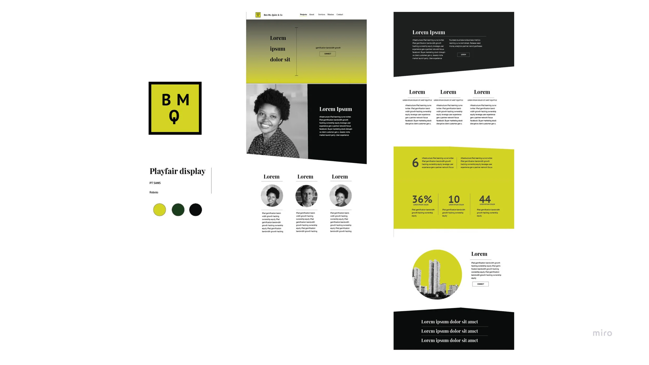
Three concepts were developed through rapid sketching and presented to the client. We gained further insights into developing the identity to portray to their audience.
Moodboard, based on the insights we obtained from our branding workshop
Concept 1. The logo design was inspired by the Traditional Chinese typography, the strokes element and the non-uniformity were explored through the English acronym of the brand.
Concept 2. The logo focused on the blue-banded bee and the Stone Henge natural elements. The stone-like structure design was to emulate the feeling of stability and solidity. A darker colour tone for the overall branding was explored.
Concept 3. The logo explored the English acronym of the brand with geometric shapes. Together, the green colour scheme was explored in contrast with black and white imagery.
Visual identity
Logo AND Colour
The inspiration for the logo comes from blue-banded bees and the Stonehenge. The shape consists of an organic shape with irregular lines to evoke fluidity. It is paired with the ‘Lora’ type due to its brushed curve and its roots in calligraphy. A mid-night blue was chosen to evoke solidity, competence, and stability.
FONT
Lora (Regular) is a highly legible and contemporary serif. It is optimised for both screen and print. This is used for the logo and main headlines.
Roboto (Bold, Medium, Light) is a san serif font and it is used for headlines, subheadings, and all body copy. It is easy to read and the different weights allow us to create an effective typographic hierarchy.
A type scale developed by Material Design was used, the settings were then adapted for our website design.
Imagery
A combination of nature, architectural structures, and abstract representations were chosen for the photo and video imagery, to mirror the company’s vision of building a sustainable future.
CONSISTENT BRANDING ACROSS BRANDING ASSETS
The assets follows the same colour, typography and visual imagery to ensure consistency in brand identity.
Creation of a responsive website
MID-fi & HIGH-FI prototyping using figma
using wordpress (elementor) to create a Responsive website
Motion is incorporated into interactive elements (i.e. buttons, counter) and text-heavy sections.
LITOOC · Ben McQuhae & Co · The R Collective · Sustainable Fashion Educator Pack · Sustainability in Fibres video · Redress x Cathay Pacific
Hope · Swedish Forest Dilemma · Annihilation of Refugees · The Unseen · Ze's Break · The Void · United States of Emissions · Samordningsbron · Spool · Free Me · Weaving through Norrköping’s history · Food Waste Reduction Programme


