United States of Emissions
Interactive data visualisation design
Group project with Linnea Michel and Afina Zahra
MSc Design in Linköping University, 2018
Scope
Data visualizations can be a useful tool for exploring and communicating complicated information, but they can also distort or misrepresent data. How can we design better data visualisations to help people understand more easily?
Our project is to design an interactive visualisation concept with United States’ data sets, including GHG (Greenhouse gas) emissions per capita, GDP (Gross Domestic Product) per capita, and the population of a state. This cartogram shows the relationship between these three variables.
MY ROLE:
Graphic Design, Data cleaning and analysis
Timeline:
4 weeks
Tools
Excel, Tableau, Adobe Illustrator
1. Our Process
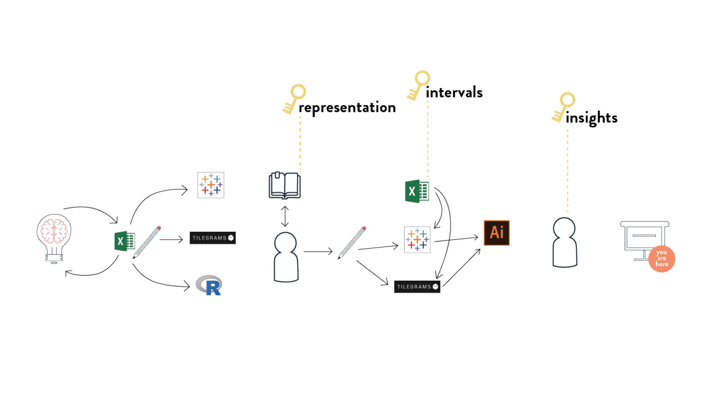
The following depicts our process for our project:
Research, defining project scope, and data cleaning
Exploration of data sets through sketching, Tableau, R, and online tools (i.e. Tilegrams)
Ideate on the representations of selected variables and interactivity of data sets
Finalize designs
2. Key design decisions
We explored different types of cartogram, and ultimately decided on the Tilegrams as it provides clarity and easier comparison across different states.
One of the key challenges for this data visualization was how to ensure readability and clarity for three different variables.
We explored various geometric shapes, structures and overlays.
Classifying data was also an important step as it affects how the data is visually presented. We explored various methods like intervals of constant size, quantiles method and Fisher-Jenks algorithm.
We ultimately selected the ‘Quantiles method’.
3. Outcome
Feature 1
The user can hover over the tile and it will display information in relation to the state.
The data can be sorted by a specific category, the example here on the right shows the states with the lowest percentile of emission.
Feature 2
A scatter plot diagram is designed for users to further explore the data set. Here, the users can identify the trends, the relationship between the variables and any outliers. The user can again click on the data and obtain information relating to the state.
Feature 3
A state comparison function is designed to allow comparison between two states and shows the breakdown of emissions by sectors.
LITOOC · Ben McQuhae & Co · The R Collective · Sustainable Fashion Educator Pack · Sustainability in Fibres video · Redress x Cathay Pacific
Hope · Swedish Forest Dilemma · Annihilation of Refugees · The Unseen · Ze's Break · The Void · United States of Emissions · Samordningsbron · Spool · Free Me · Weaving through Norrköping’s history · Food Waste Reduction Programme


